MEDIARA APP
A mobile app that improves nursing management and real-time communication.
Role:
Design Project Lead
Timeline:
July - August 2025
Tools
Figma, Adobe Illustrator


The Problem
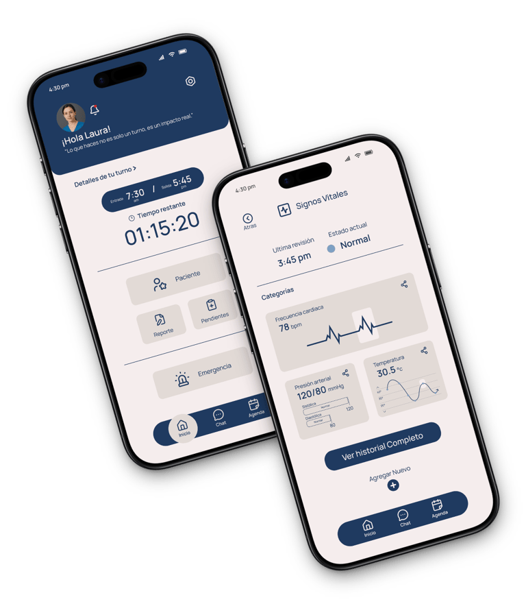
Medical personnel often face communication difficulties, disorganization, and inefficient systems for recording vital signs or responding to emergencies.
These problems can delay decision-making and affect the quality of patient care.


The Objective
Design a mobile app that optimizes medical coordination through intuitive navigation, real-time communication, and efficient tools for recording and monitoring vital patient information.
NEXT:
FULL CASE OF STUDY
READ TIME:
5 MINUTES
THE USER
USER RESEARCH - CRITICAL POINTS
PERSONA
PROBLEM STATEMENT
USER JOUNEY MAP
INTRODUTION
THE USER
PROTOTYPE
THE DESIGN
CONCLUSION
II
*I conducted interviews with medical and nursing staff*, which I then transformed into empathy maps to better understand users and their needs within the hospital setting.
I discovered that many professionals value having a fast and reliable digital tool to record, review, and share patient information. However, current systems are often confusing and slow, leading to frustration and delaying their work.
This turns what should be agile and organized tasks into a tedious and impractical experience.
User Research - Critical Points

Navegation
Current medical record systems often have a cluttered and unintuitive interface, making it difficult to quickly find patient information.
Interaction
Experience
Small buttons and menus make interaction difficult, leading to errors when entering or querying data, especially during busy times.
Existing platforms don't offer a seamless experience tailored to the needs of healthcare workers, which reduces efficiency and creates frustration in daily use.




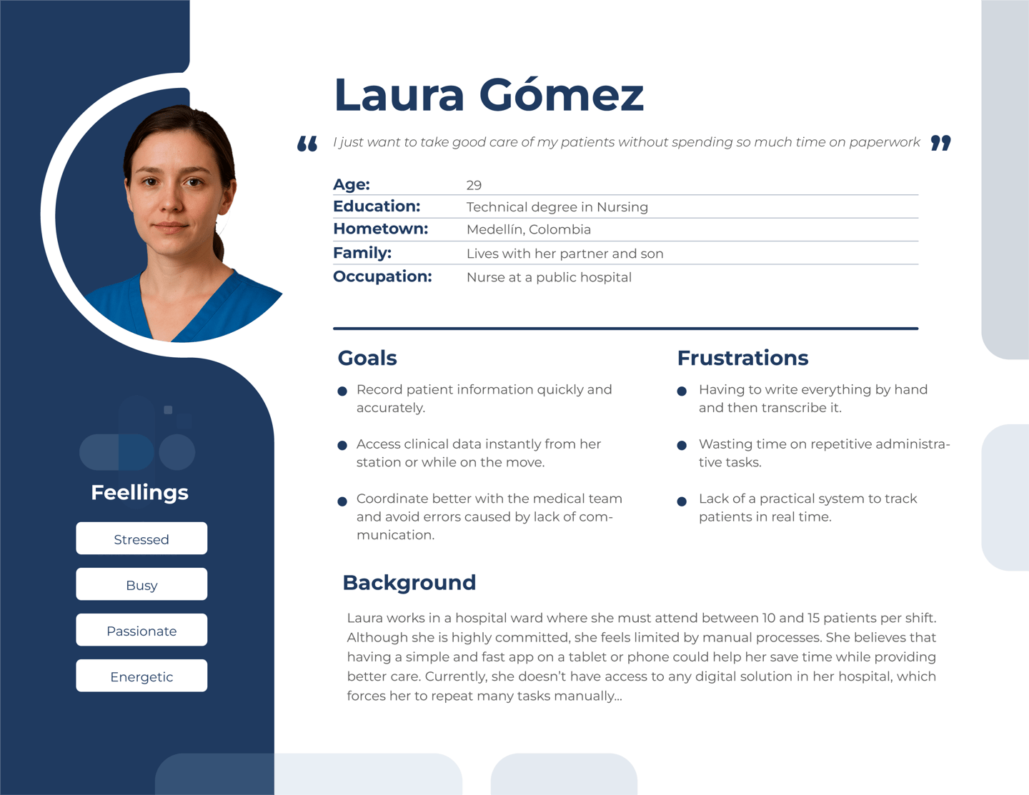
Persona: Laura
Problem Statement
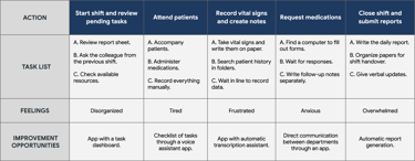
Laura works in a hospital ward where she must attend between 10 and 15 patients per shift. Although she is highly committed, she feels limited by manual processes. She believes that having a simple and fast app on a tablet or phone could help her save time while providing better care. Currently, she doesn’t have access to any digital solution in her hospital, which forces her to duplicate her efforts.
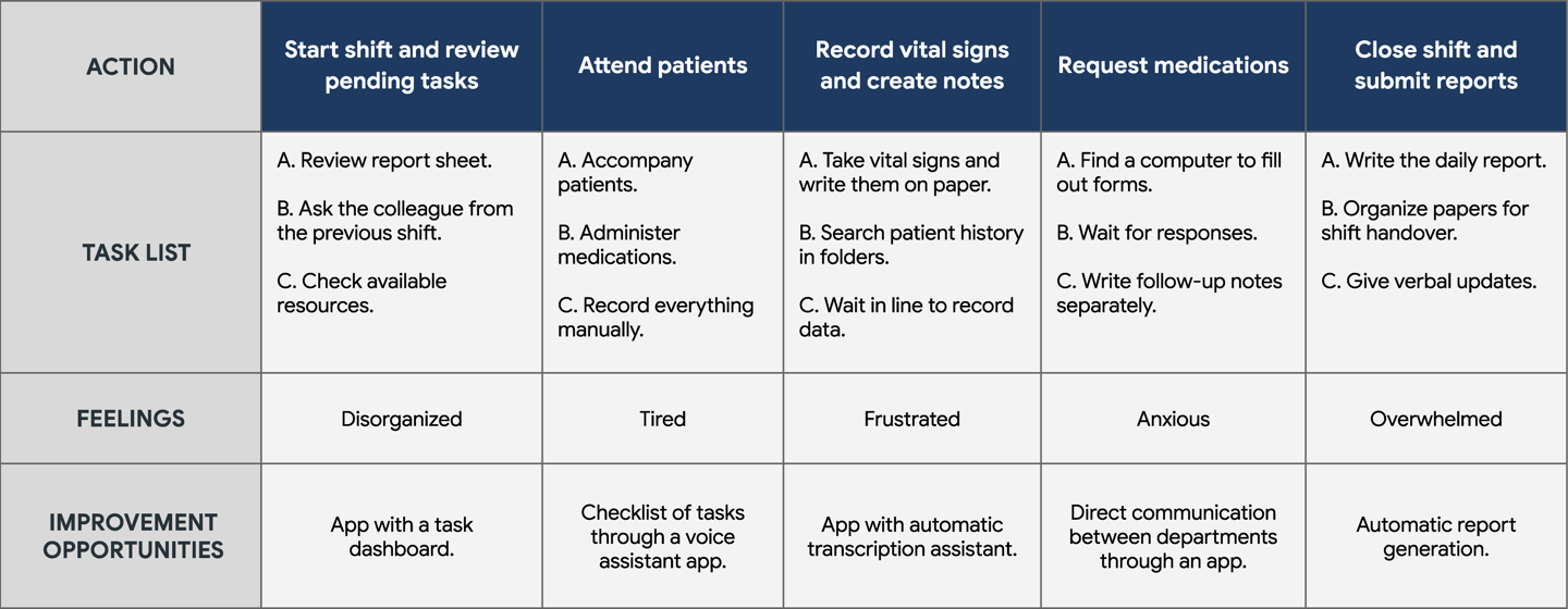
User Journey Map
PROTOTYPE
SITE MAP
PAPER WIREFRAMES
LOW-FIDELITY PROTOTYPE
USABILITY STUDY
INTRODUTION
THE USER
PROTOTYPE
THE DESIGN
CONCLUSION
III
Site Map


Low-Fidelity Prototype
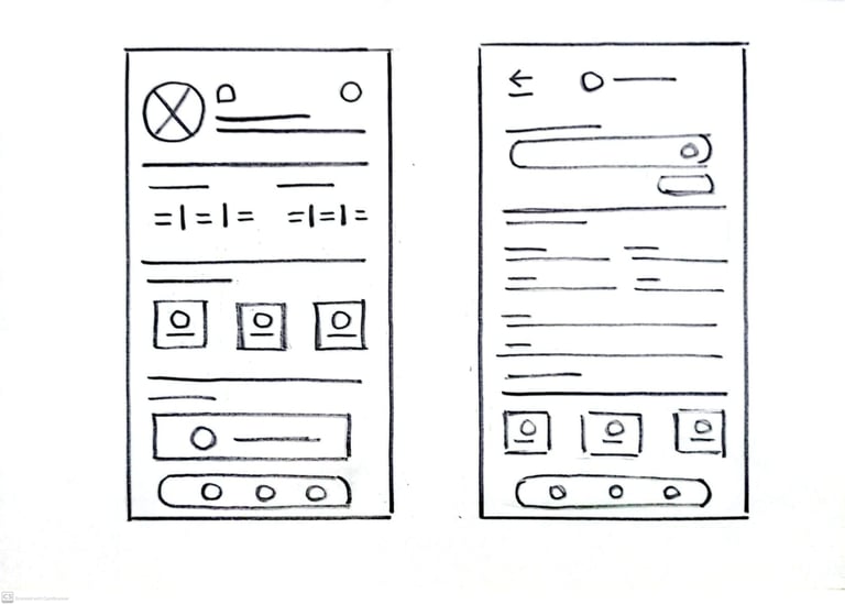

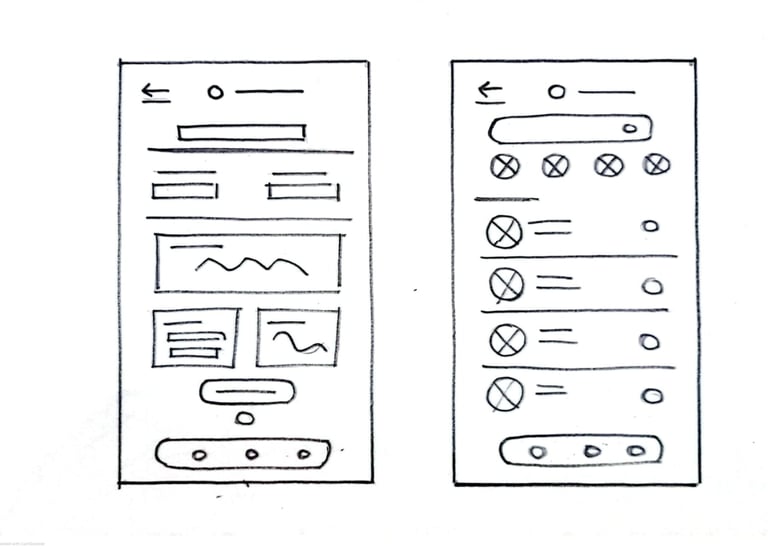

I created paper sketches for each of the main screens of the application, taking into account the pain points identified in relation to navigation and quick access to patient information.
The variations of the main screen wireframe focused on optimizing the user experience by making it easier to view tasks, reports, and medical records in a clear and efficient way.
Paper Wireframes
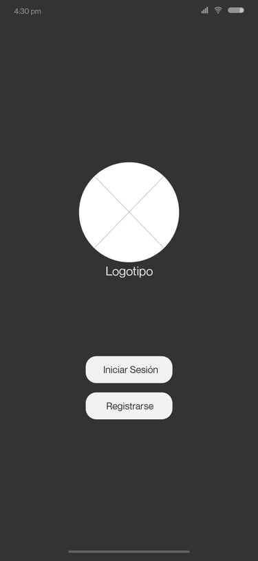
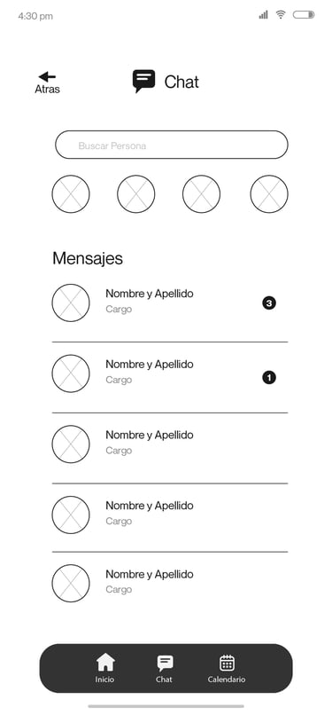
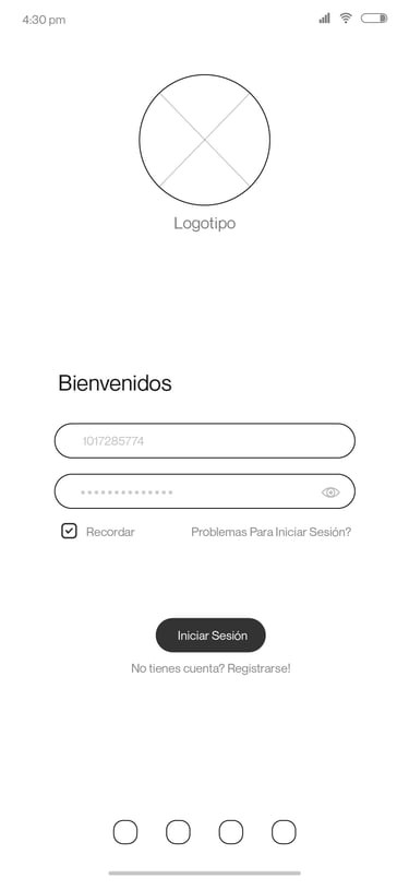
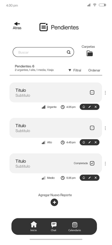
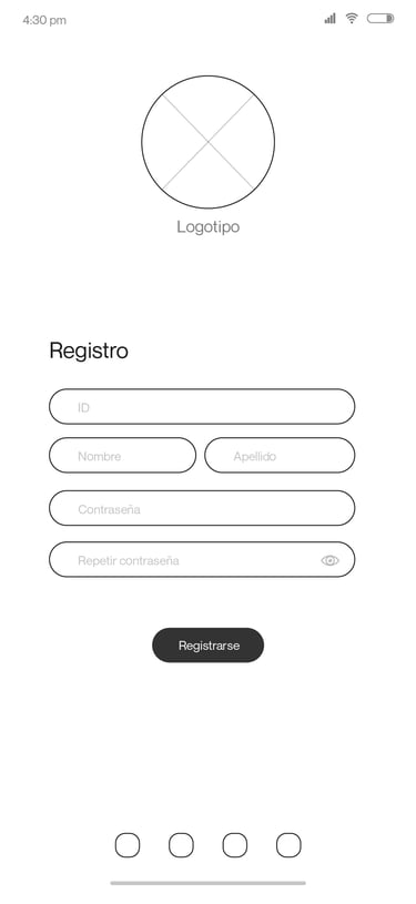
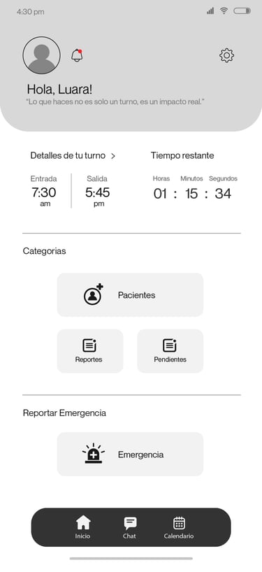
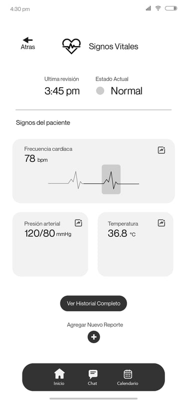
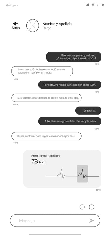
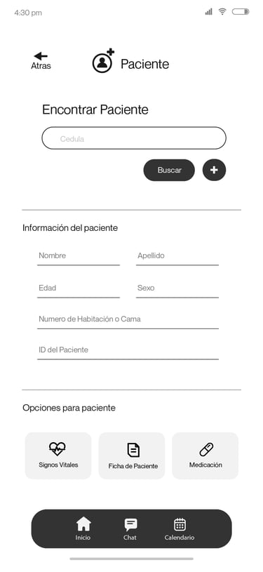
To create the low-fidelity prototype, I designed all the app’s screens in low fidelity and connected them to compose the main user flow of the application.
At this stage, I received feedback from several people regarding aspects such as button placement and screen organization. I carefully listened to their comments and implemented many of their suggestions to improve usability and reduce the friction points identified during the research.


Usability Studie
Type of study:
Unmoderated
Participants:
3 participants
Location:
Colombia, remote
These were the main findings identified during the usability study:

Sign Up
The registration screen wasn't initially created, which would have made it difficult for new staff to access it.


Patient data
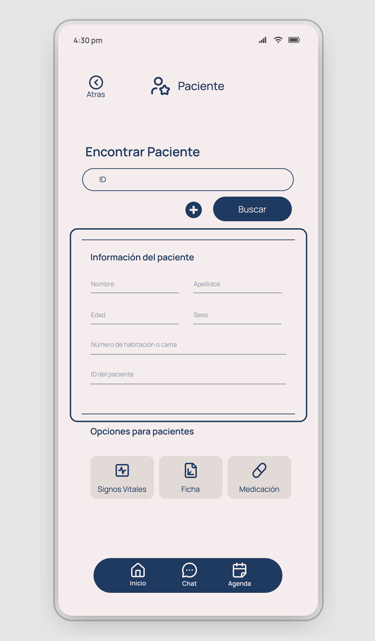
Only the patient's main information, such as name and age, appears, but no other relevant data.


Reports
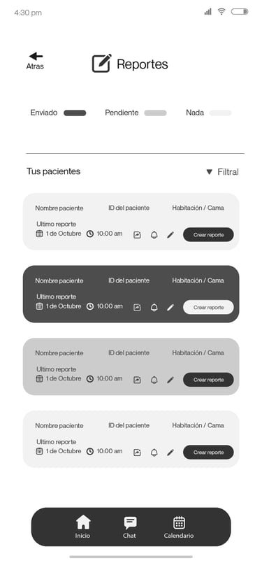
There was no way to differentiate between reports that had already been sent or those that were pending.
THE DESIGN
HIGH-FIDELITY PROTOTYPE
IMPROMEVENTS
MOCKUPS
INTRODUTION
THE USER
PROTOTYPE
THE DESIGN
CONCLUSION
IV
Mockups
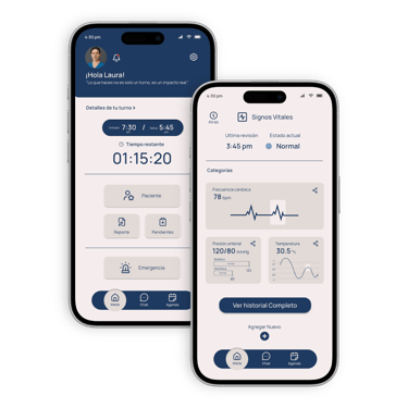
Improvements
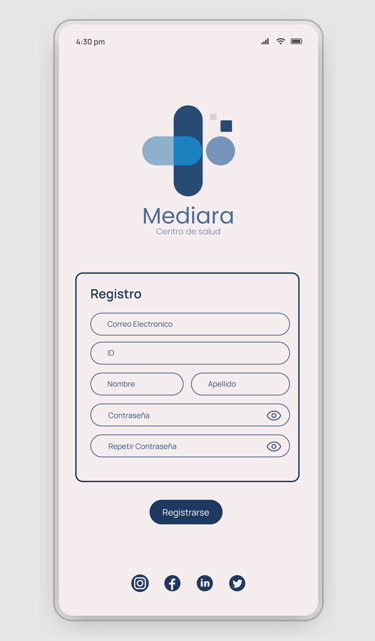
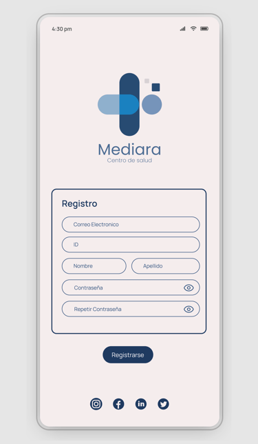


Added a "Sign up" screen to provide a way for new hospital staff to register for the app.


A table has been added with more detailed patient information:
First and Last Name
Age
Sex
ID Number
Room or Bed Number
A color-coded index has been added for each status of the report:
Submitted
Pending
Nothing

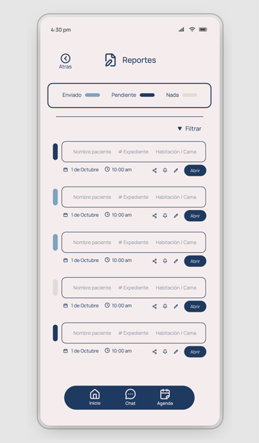

High - Fidelity Prototype
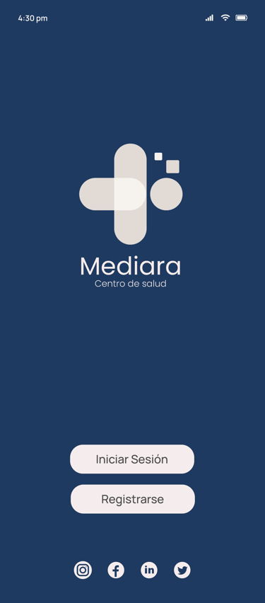

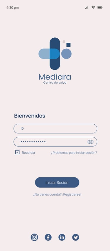

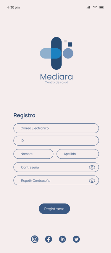

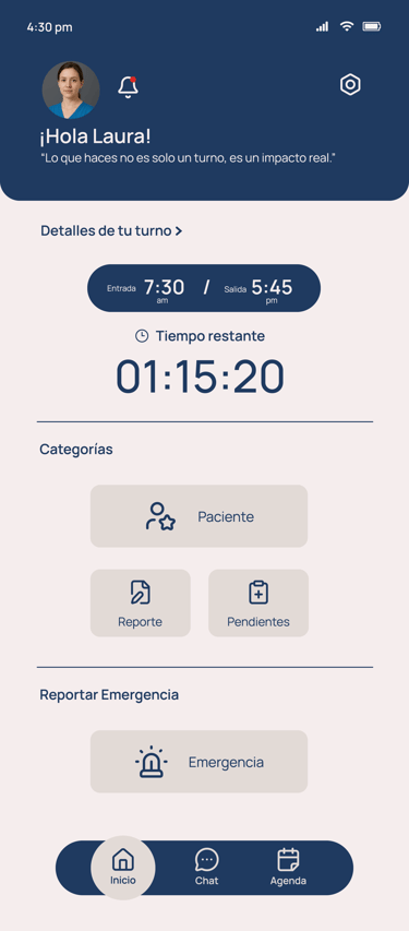
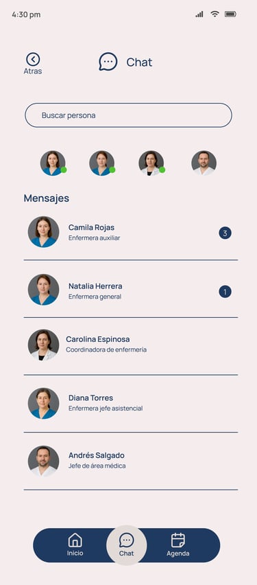

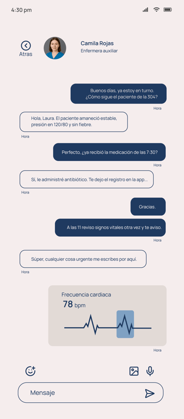


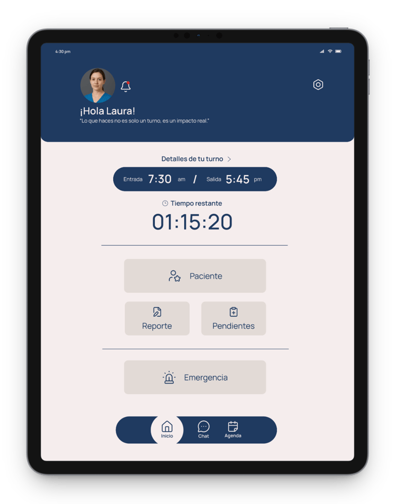
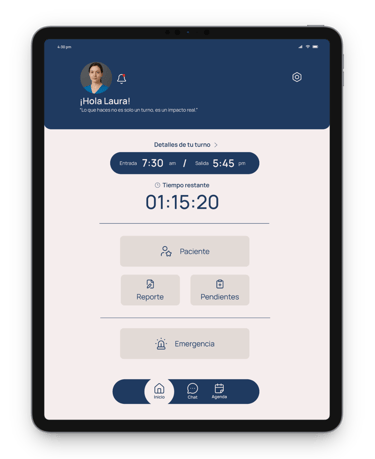
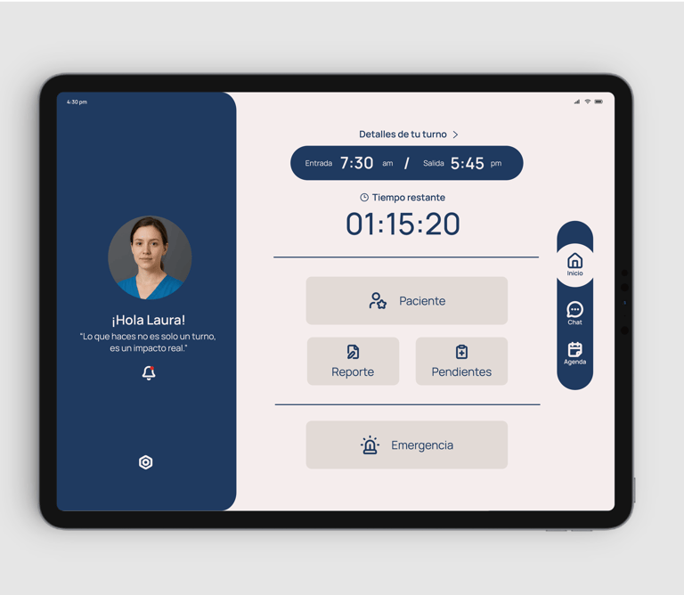

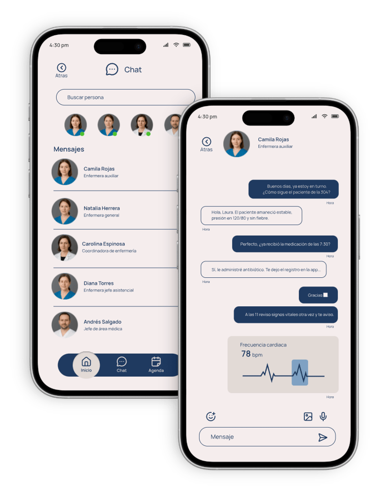
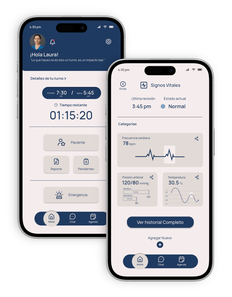
I incorporated the adjustments made after the usability study; Corresponding colors, text, and images were added, as well as several other button size improvements, all with the goal of optimizing the app's experience and visual clarity.
CONCLUSION
INTRODUTION
THE USER
PROTOTYPE
THE DESIGN
CONCLUSION
V
Users highlighted that the design of the application was intuitive and easy to navigate. The organization of information and shortcuts to key functions allowed them to save time in their daily tasks, improving efficiency and patient care.
I learned that in hospital environments, even a small change in the interface can have a big impact on the user experience. This project taught me the importance of actively listening and designing solutions focused on simplicity, speed, and visual clarity.
Thanks for visiting!
juancos.199@gmail.com
+57 305 324 29 81
Juan Oporto © 2025
